SIBAGEN
Modernizing an all purpouse Insurance Underwriter Portal
Modernizing an all purpouse Insurance Underwriter Portal
The existing underwriter portal relied on a dense, grid-based UI with cluttered columns and outdated styling. New users struggled during onboarding due to:
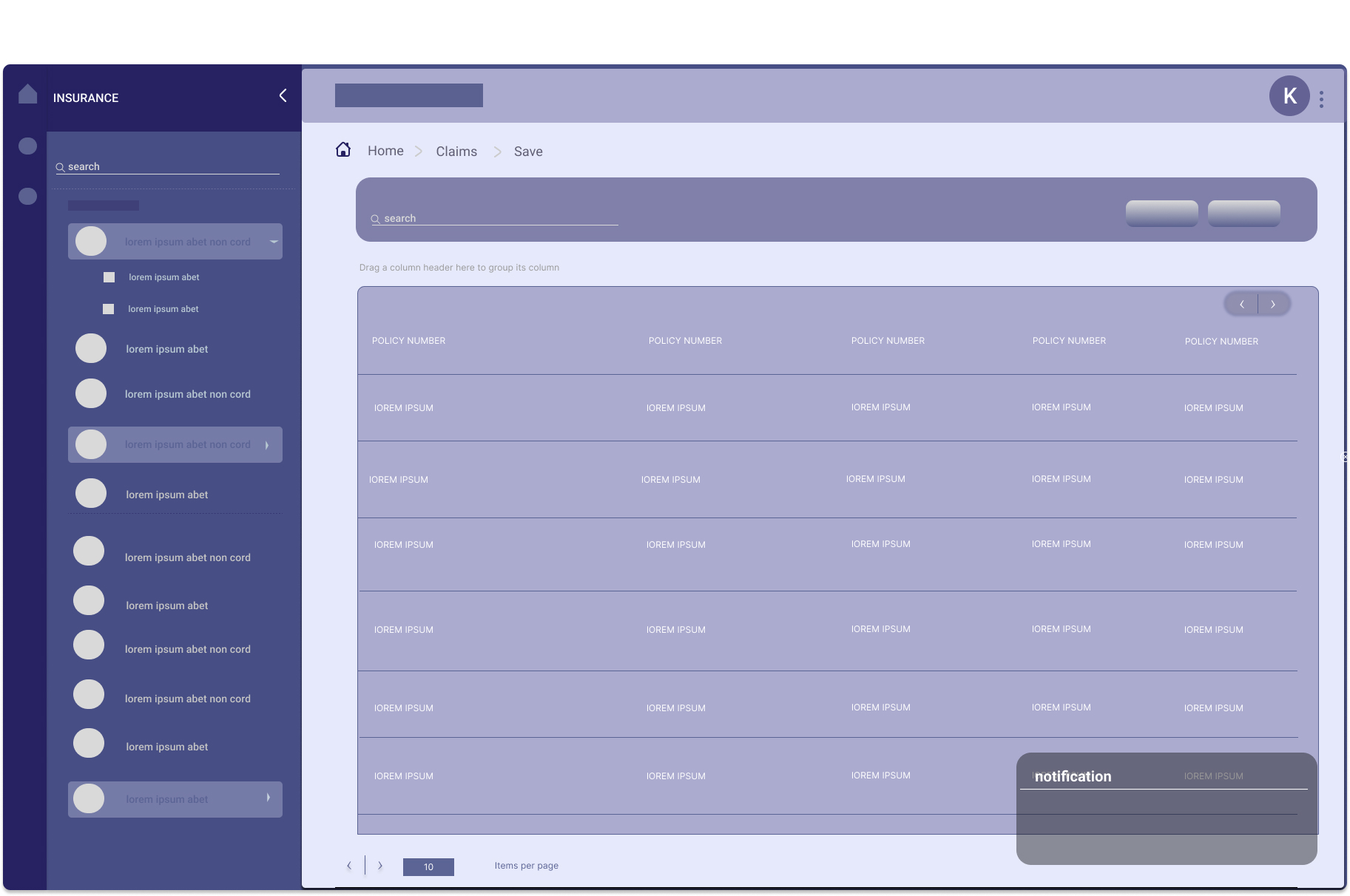
To create a modern, user-friendly portal where underwriters could efficiently key in user info, fill setup forms, and complete transactional forms, while also integrating a notification flow and visible wizards to guide users through complex processes.
Before diving into the redesign, I conducted a series of user interviews, collaborated with stakeholders and interviewed underwriters to understand the pain points of the current portal and gather insights on how to improve it.
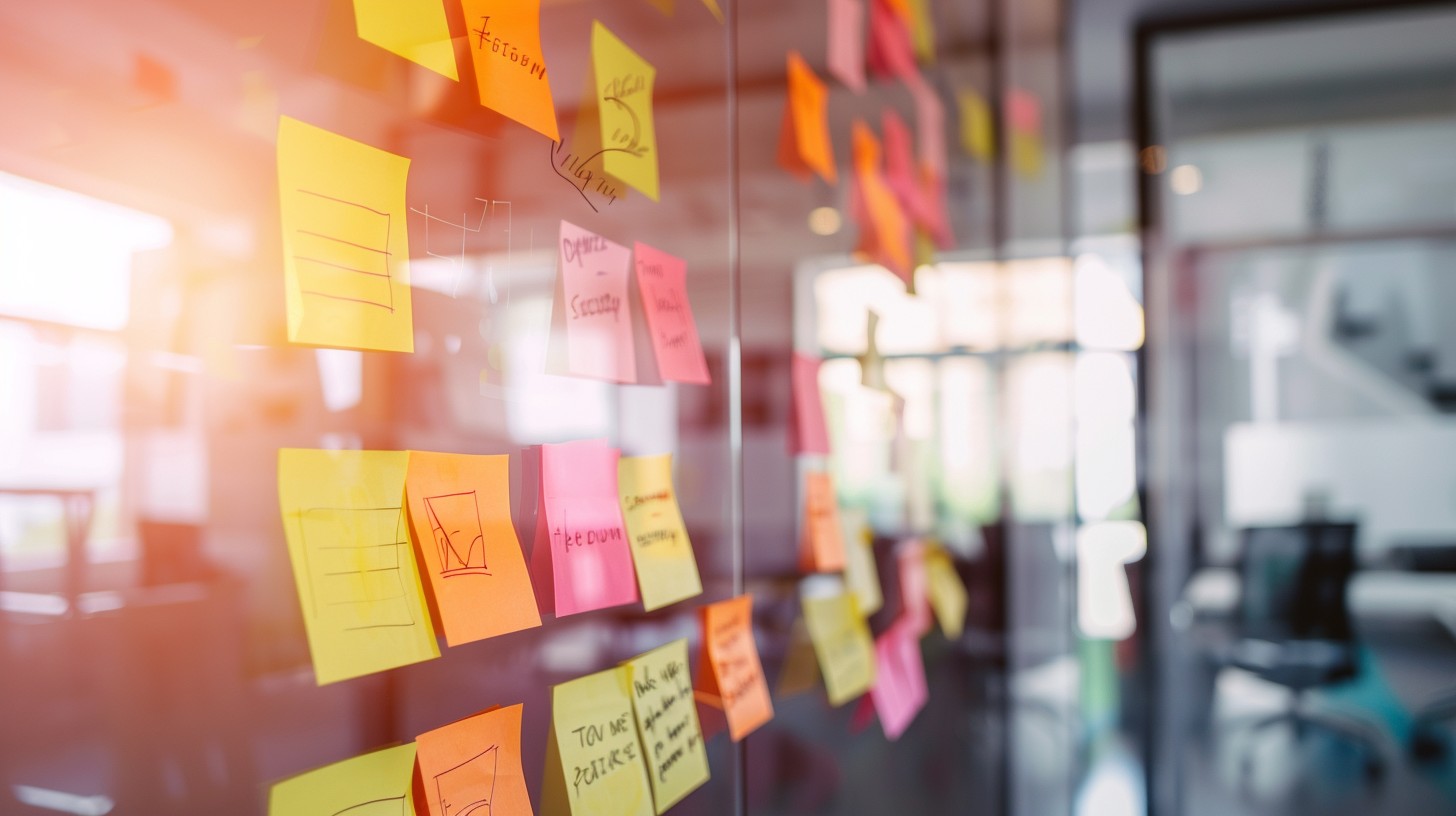
Building on the insights gathered from user interviews, stakeholder discussions, and competitive analysis, I structured the redesign process to address key challenges and enhance the user experience. I outlined essential features and created wireframes and prototypes for user testing.
After conducting a series of ideation exercises (i.e Affinity Mapping, Crazy 8's and Stakeholder Feedback Loop ) and based on past experience with similar reqeusts and products I explored two different design approaches to modernize the insurance portal’s features, ensuring a more aesthetically pleasing and user-friendly experience. These approaches focused on enhancing UI/UX by improving navigation, simplifying interactions, and creating a visually cohesive interface.
The two design approaches considered for the portal redesign were:
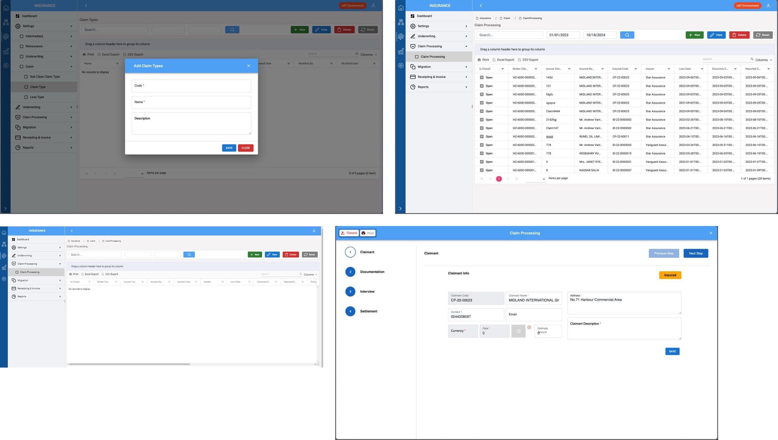
After evaluating the pros and cons of each approach, we ultimately settled on the modern, whitespace-driven design you see here. This decision was based on its clean layout, improved readability, and seamless user experience.
To align stakeholders with the redesign vision, I curated a selection of design inspirations showcasing modern UI principles and best practices. These references played a crucial role in guiding the final iteration of the portal.

To establish the foundation for the redesigned portal, I began by creating low-fidelity wireframes. These wireframes focused on structuring the layout, defining key interactions, and improving the organization of essential features. The goal was to simplify navigation and enhance usability while maintaining a clean and intuitive interface.
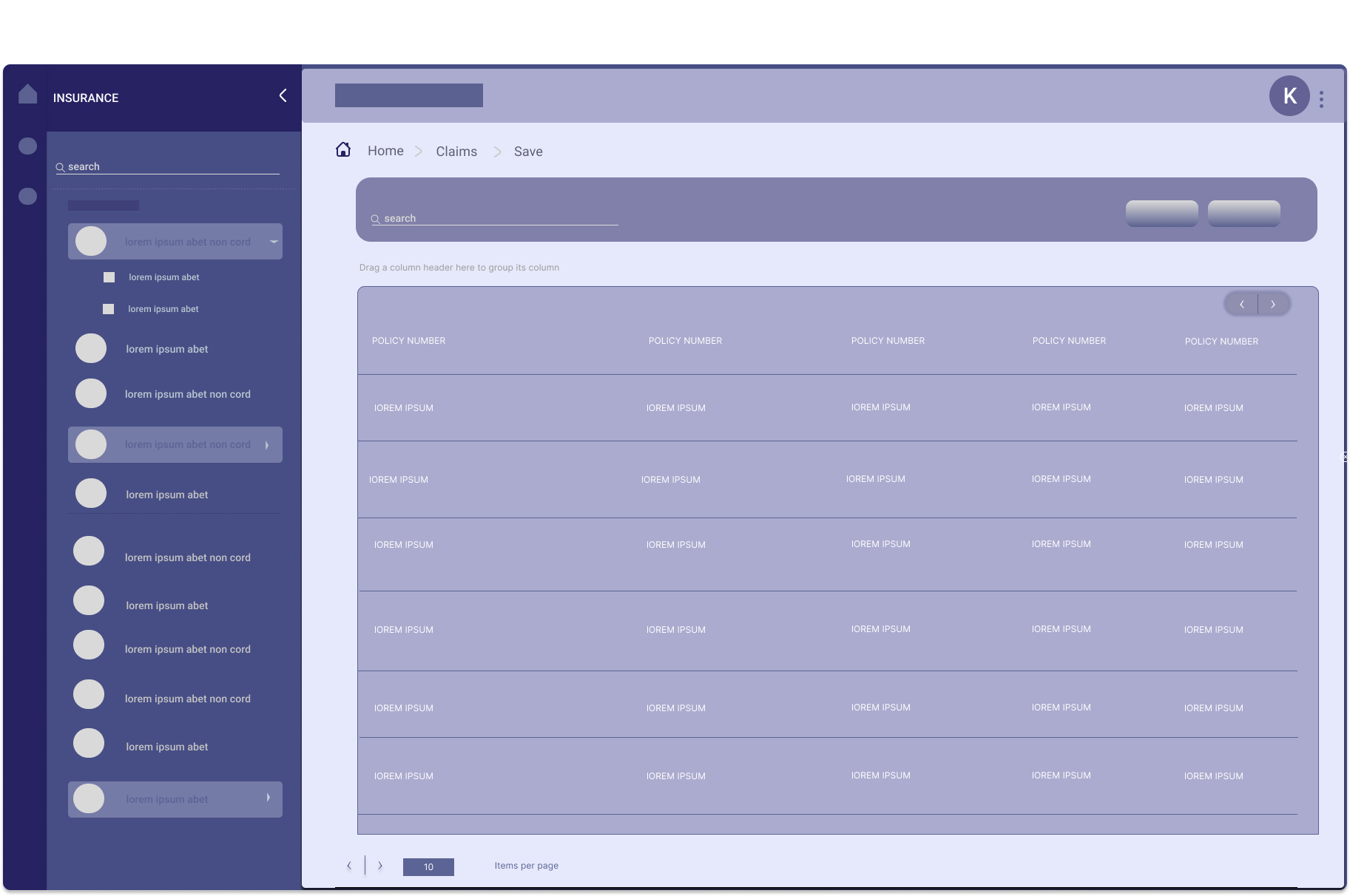
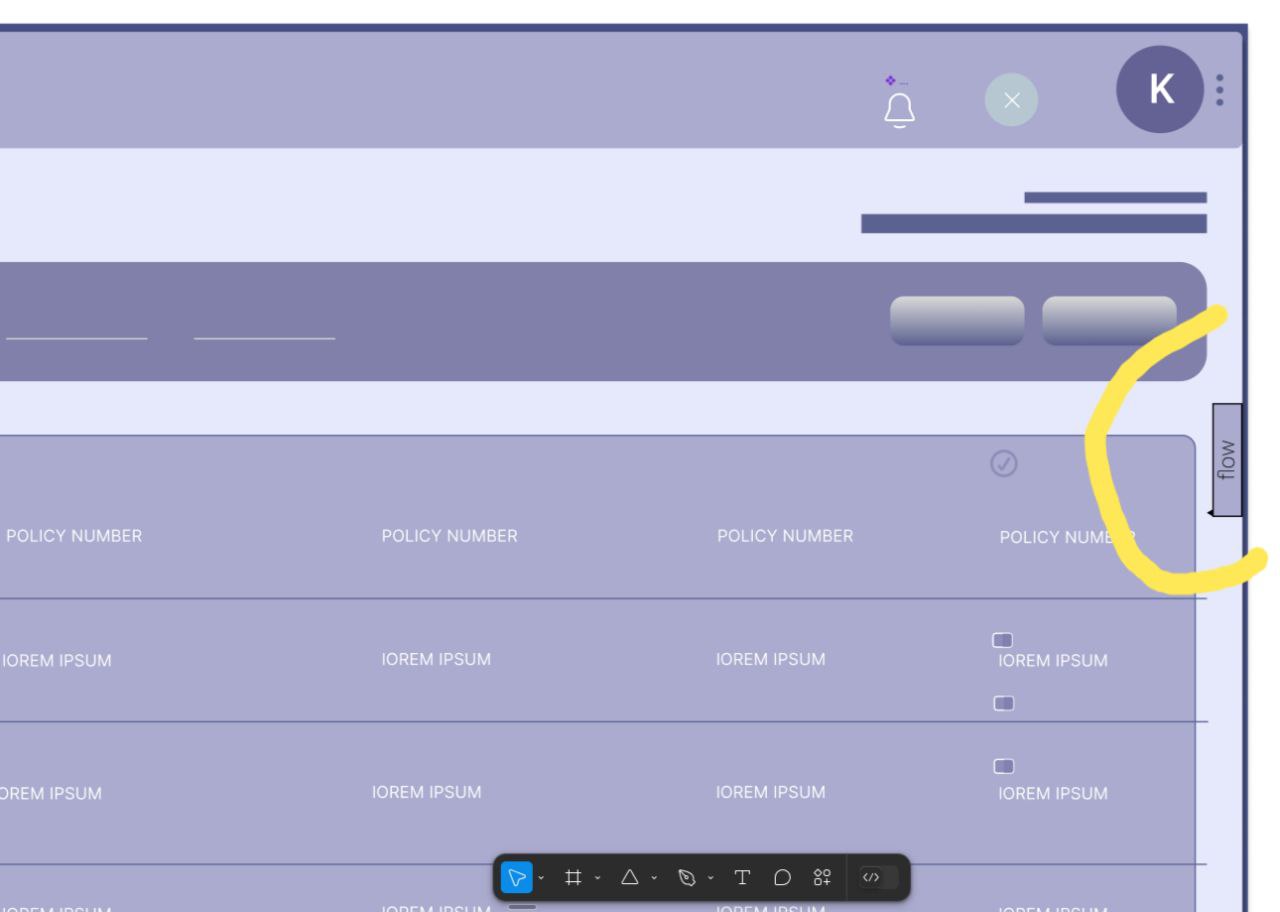
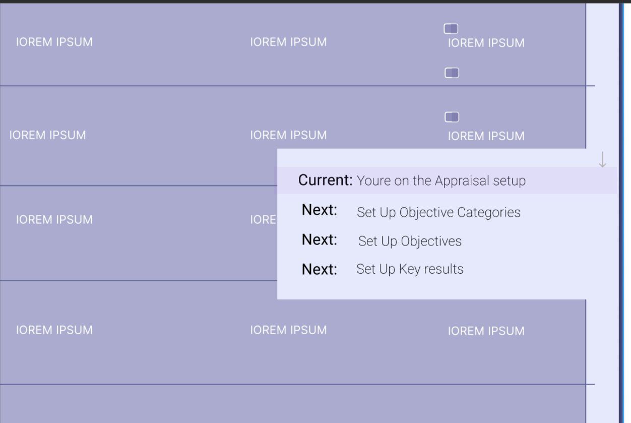
These wireframes were presented to underwriters for initial feedback to set the tone for the overall structure of the application. Based on discussions and observations from these sessions, a key feature was introduced—an always-visible flow mapper button, allowing underwriters to track their next steps at any time. This feature was inspired by insights drawn from the fifth and sixth wireframe images, addressing the need for better process visibility.
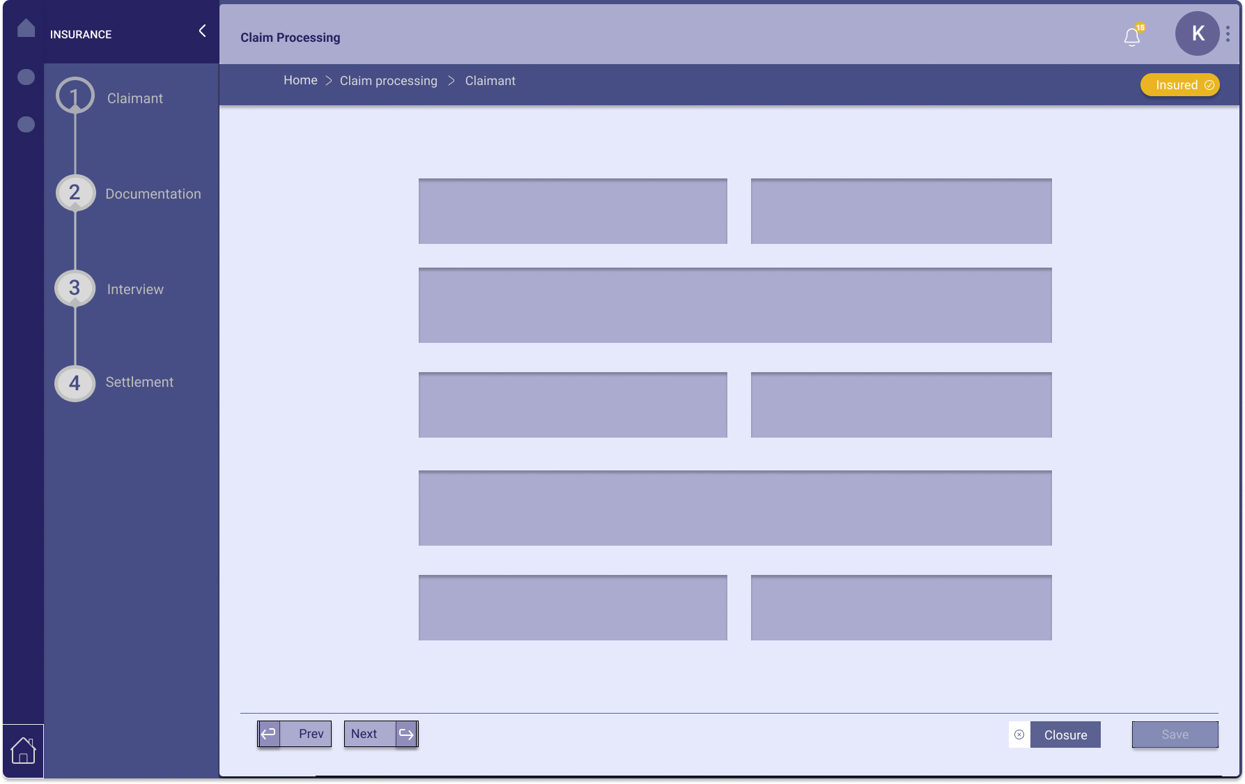
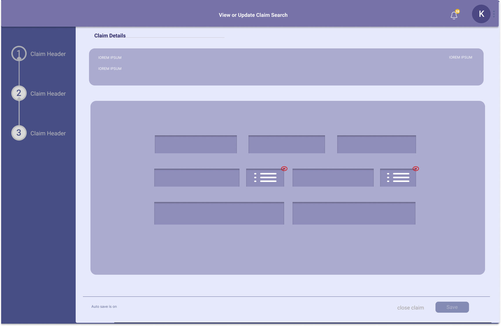
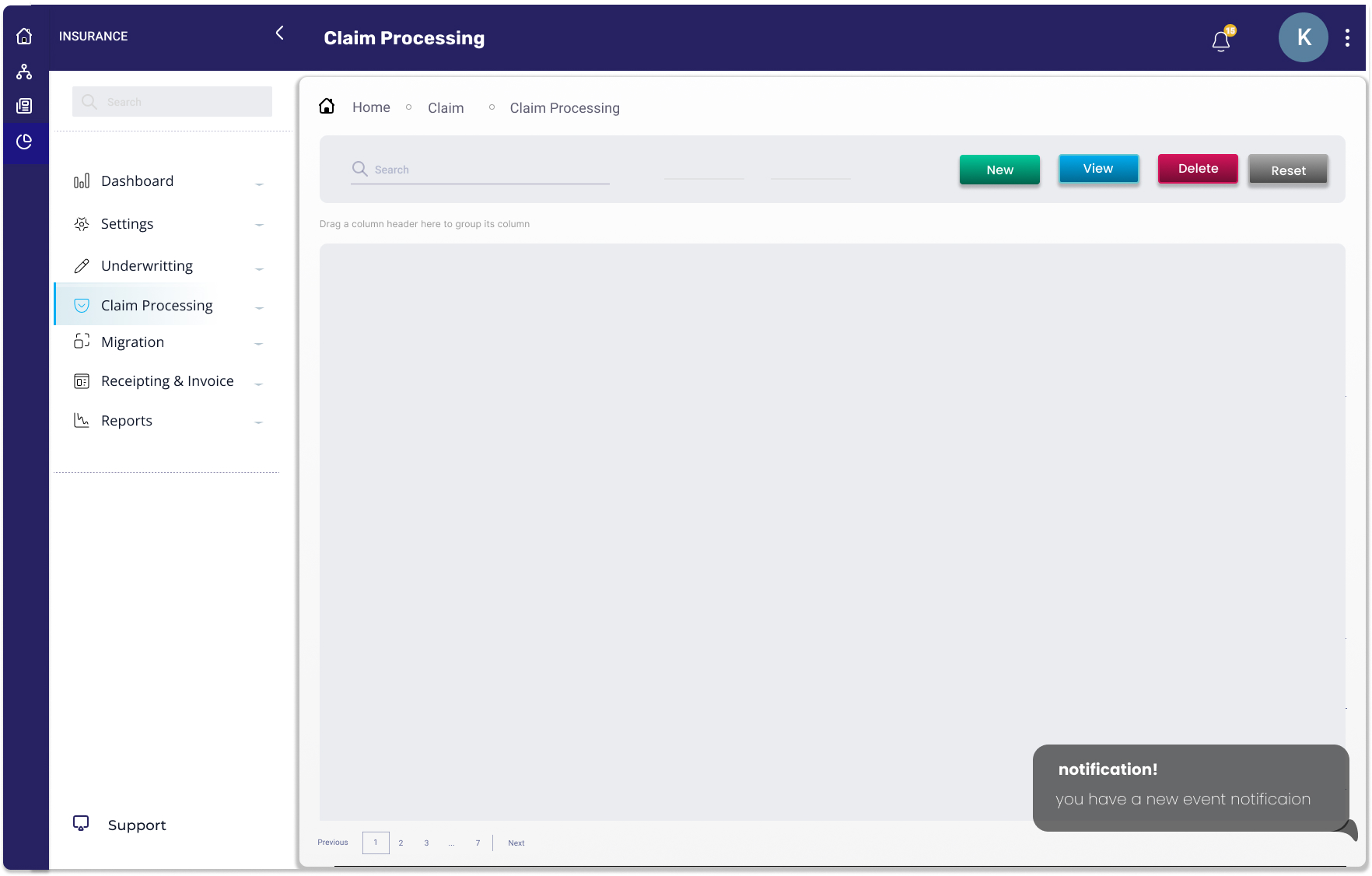
Incorporating insights from the wireframe review, I developed high-fidelity prototypes to bring the design to life. These interactive prototypes captured the finalized visual aesthetics, micro-interactions, and improved usability features.
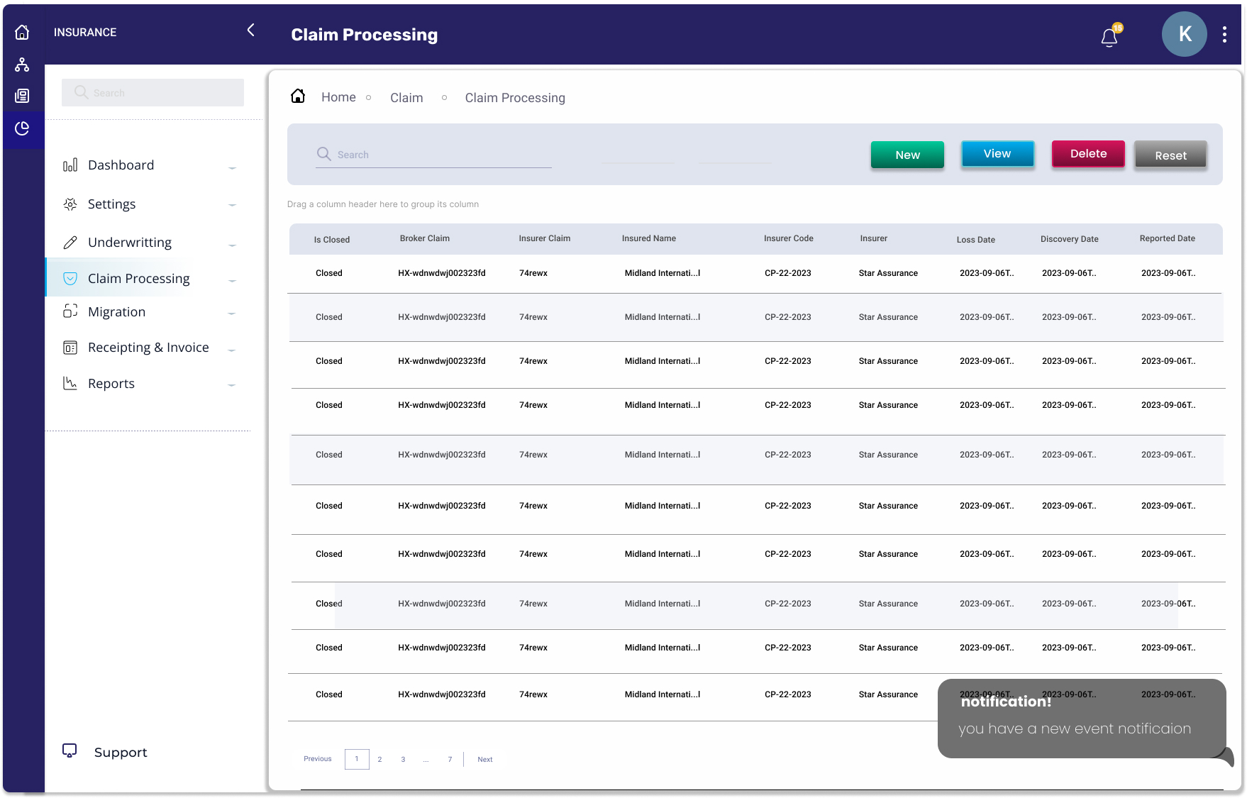
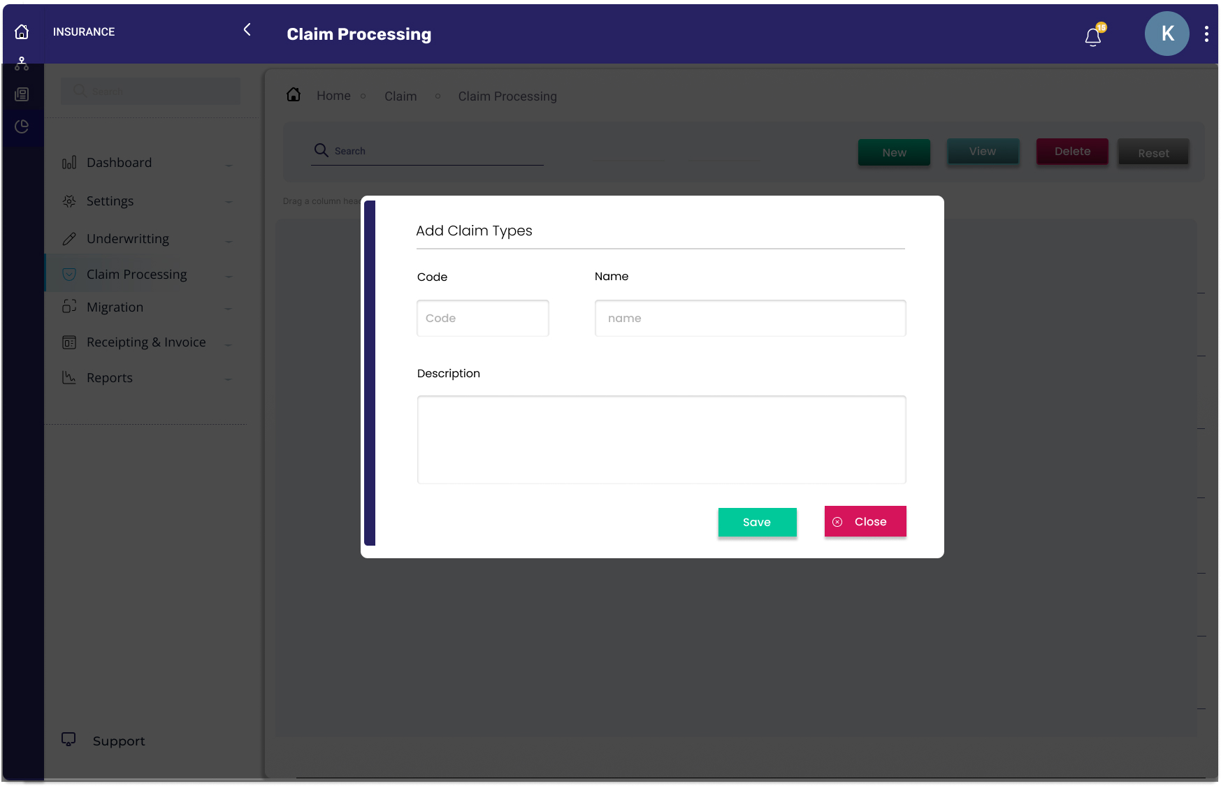
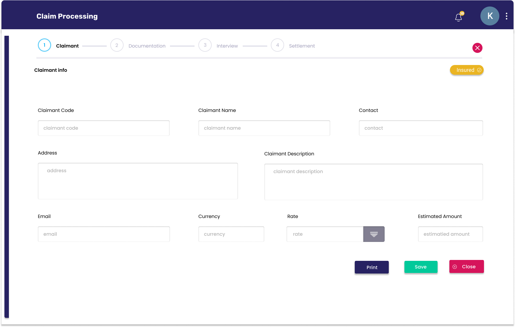
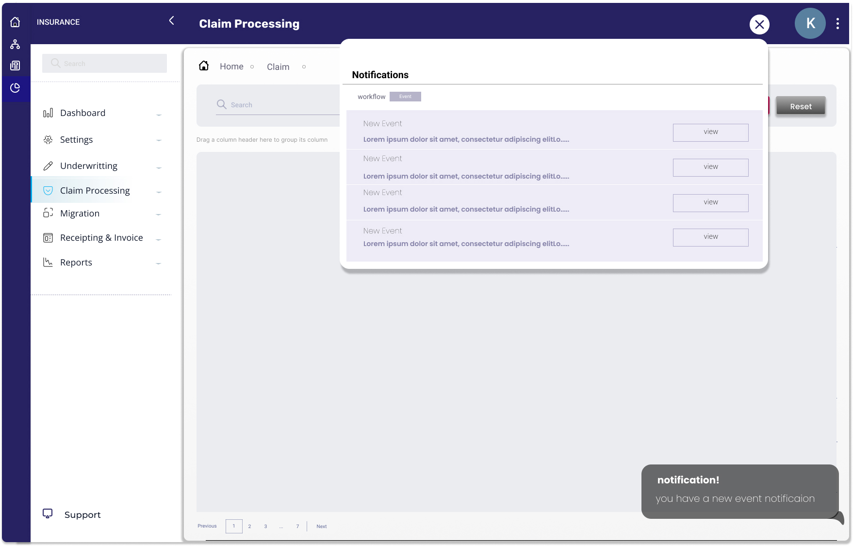
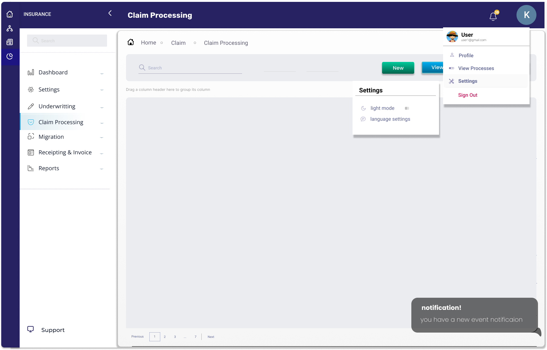
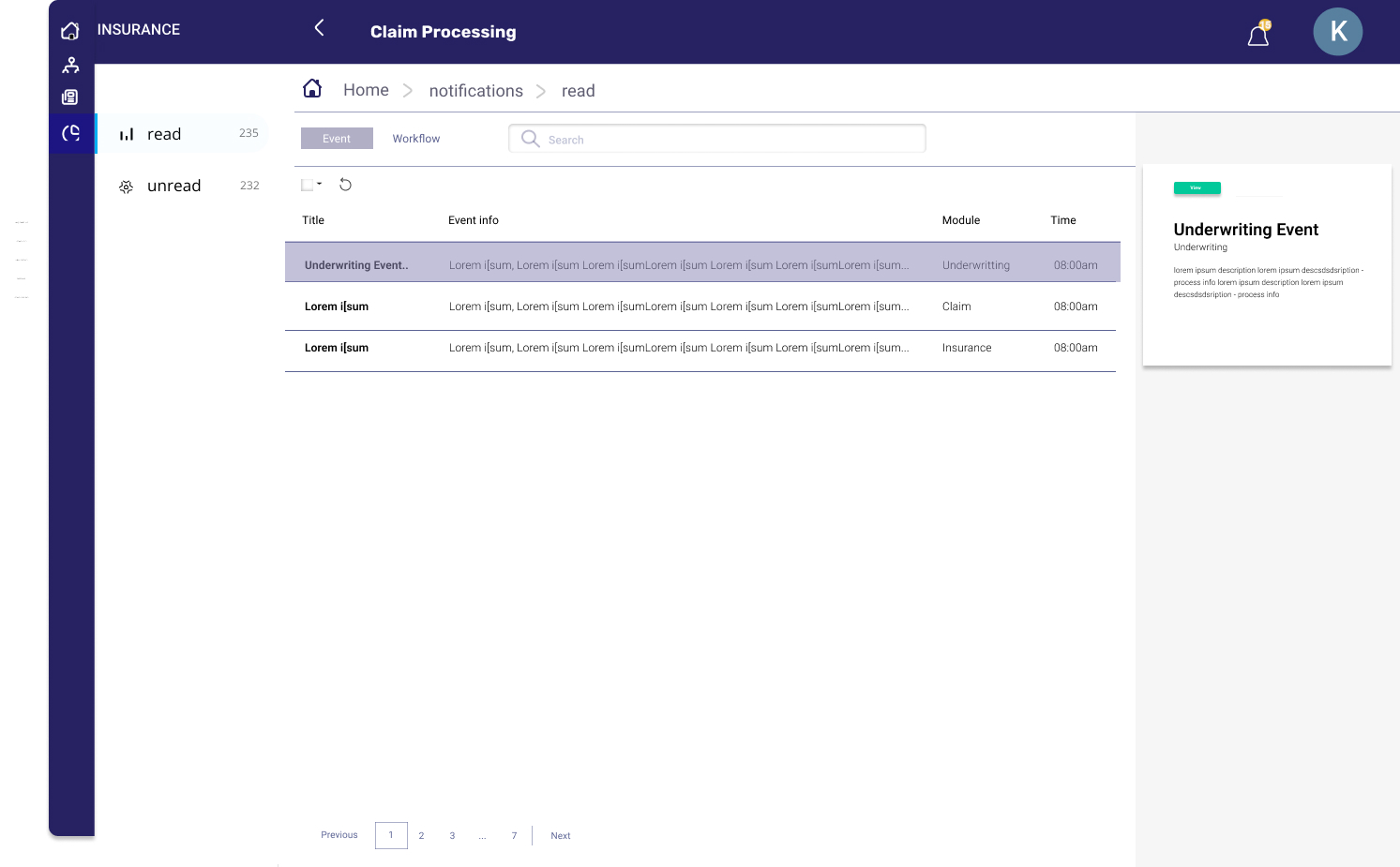
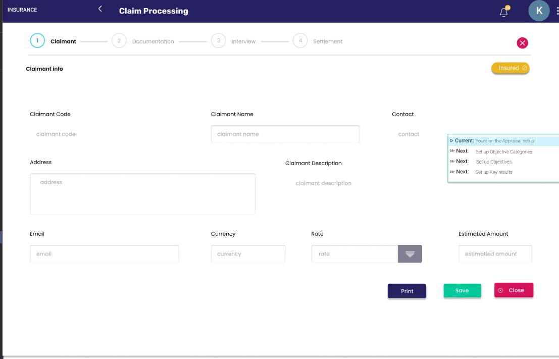
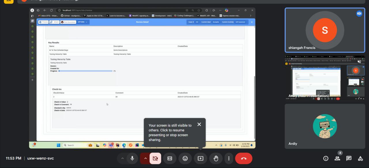
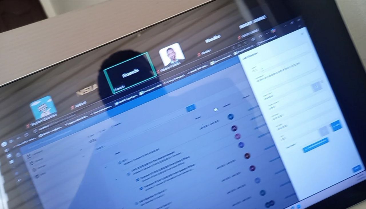
To validate the effectiveness of the design, I conducted usability testing where underwritter interacted with the prototypes in real-world scenarios. The study provided valuable insights into how users navigated the interface and highlighted areas that required refinement.
The redesign of the insurance underwriter portal was a collaborative effort that involved stakeholders, underwriters, and design teams. By focusing on user needs, feedback, and usability testing, we were able to create a modern, user-friendly interface that streamlines workflows and enhances productivity.